New features & user experience changes in Spark Chart, February 2019

We have released a significant range of exciting new survey software features and User Interface changes to make your Spark Chart survey experience easier and give you even more power.

We have taken on board a lot of feedback, balanced with the need to deliver requested features. In addition to new features, the update focuses on reducing the number of clicks to accomplish tasks, amalgamating menus, removing buttons and integrating screens together, and modifying the terminology. The change log is massive, and we are very much looking forward to getting this out there.

Next, we will be moving on with more features and a second phase of UI and UX changes.

Please take the time to read this update.

New Tours to help with the changes

Survey Software Help

New tours have been created to guide users through the functionality on all the main pages. Please take the time to follow the tours. They will help to introduce many of the changes we have implemented. Each tour will only take a minute.

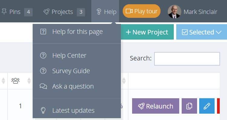
The tour button has been moved to the top panel alongside the Personal Profile.

Users have the option to hide the tour buttons under Profile/Settings/Help & Guides.

The Help and Support Menus have changed

Survey Software Help

The Help and Support menus have been consolidated and moved from the left hand menu to the Help menu at the top. Individual page help that appeared on screen for each menu has been removed in favour of a link to the Help Center article for the specific page being viewed. One aim of this change is to simplify the main menu and reduce the number of menu items.

The Help Center and support is also available from the Support icon at the bottom right of screen.

The Help Center has been revised and restructured to reduce complexity. The number of Help Articles has been reduced by about 80%.

Remember, if you need help, we provide 24 x 7 support.

New “Tips” approach in forms

A new tips layout with updated help messages has been implemented in forms. Look out for the grey panels with a question mark icon. The tips are collapsed by default to save screen space.

Survey Software Help

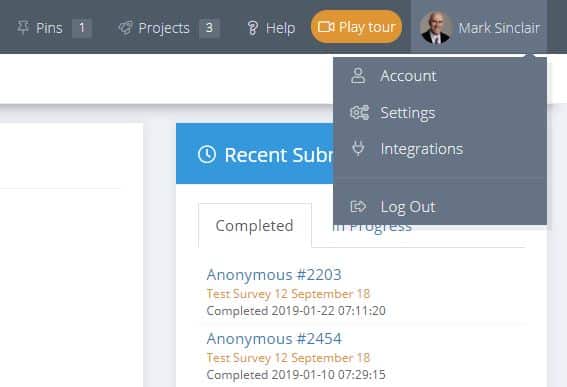
The Profile and Settings menus have been revamped

Survey Profile

The Settings menu under Personal Profile has been revamped and separated into separate sub menus (Account, Settings, Integrations). The aim is to make it easier for users to find features and also allows for new features we have implemented or have planned.

Titles have been added to the Pins and Shortcut menus to make them more obvious.

The Dashboard has more information and shortcuts

The Dashboard now has more information, shortcut options and links to results for recent individual survey submissions.

Survey Dashboard

Pin Projects, Survey Templates, Reports and Report Shares to a new shortcut menu

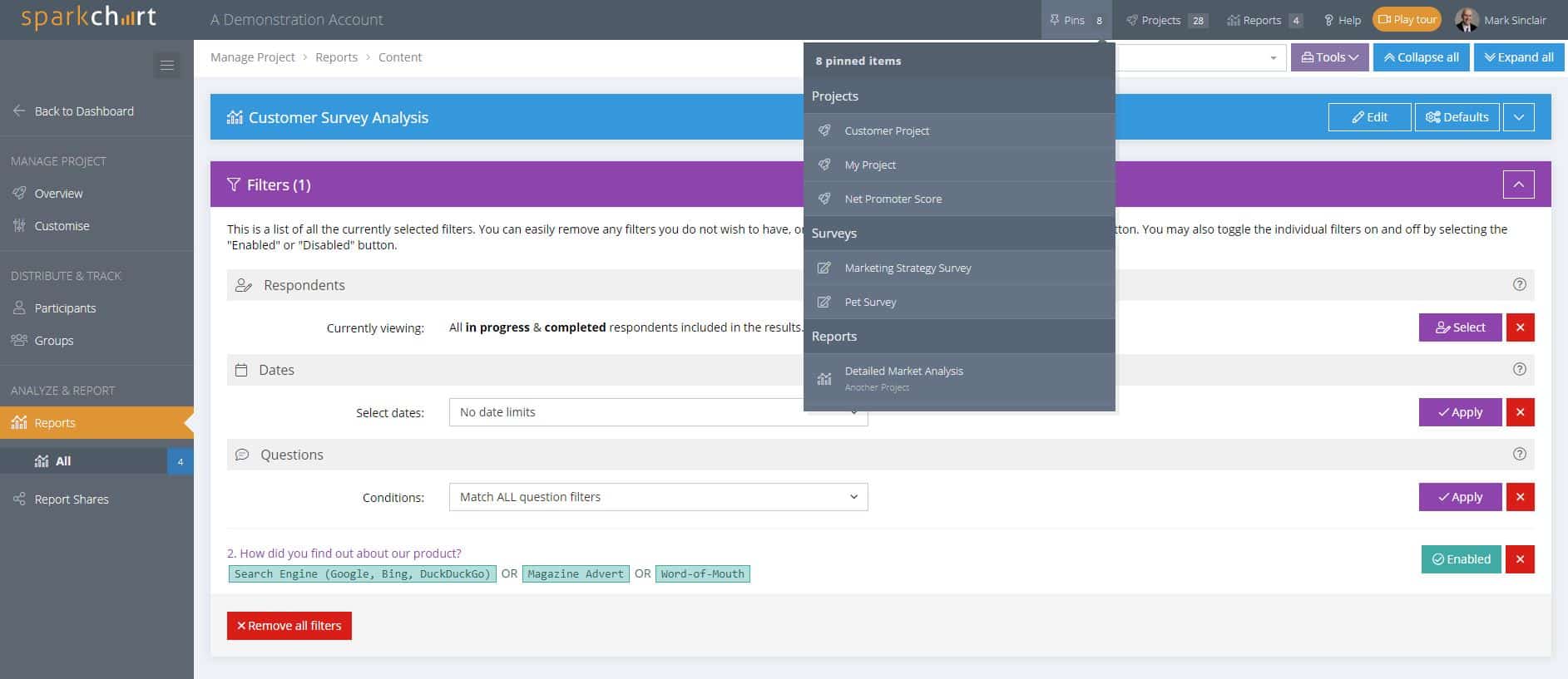
There is a new Pins menu near the user profile. The aim is to make it easier to move between currently used items. The pin functionality has been expanded beyond Projects to include Survey Templates, Reports and Report Shares.

Pinned projects will continue to also show on the Dashboard with a range of project statistics and shortcut links.

Survey Software Pins

Items can be pinned by moving the mouse over the name and clicking the pin that appears. Items that are pinned will show a coloured pin alongside the item name.

Survey Software Feature

Dashboard menu and terminology changes

Manage Project Menu

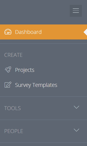
Many menu, terminology and icon changes have been implemented on the Dashboard, including:

  • The Tools and People menus are set to collapsed by default. These menus come pre-populated for new accounts and will only be needed occasionally to create new Rating Scales, Mail Templates, Answer Lists, etc. So, it makes sense to collapse them. Users have the personal option to leave them collapsed or expanded.
  • Mail Templates have moved to the Tools menu.
  • The “Themes” menu is now “Question Themes”. This is to make it clearer that Question Themes are like survey objectives and a way to group questions in a survey together to aid survey design and reporting.
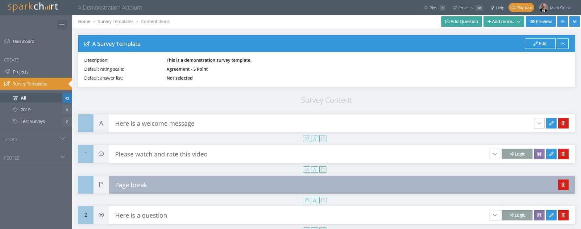
  • The Survey Templates “Content” button has been removed and merged into “Edit”, creating a single screen for editing a survey template and it’s content.
  • There is a new “Pins” feature to pin items for easy access.

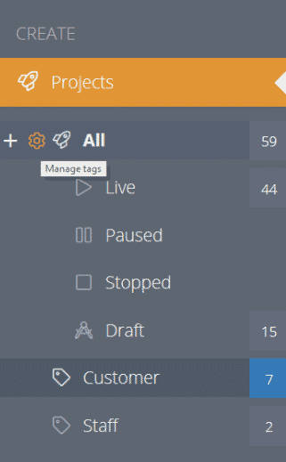
Projects now have sub menus for Live, Paused, Stopped and Draft

Survey Project Menu

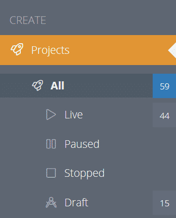
The Projects menu now has sub menus for Live, Paused, Stopped and Draft projects. This should assist with managing projects as the project list grows. The project status can be changed at the Overview menu in Manage Project.

Statistics have been added for each project.

A “Selected” option with check boxes has been added to the Projects page to allow selection of multiple projects and to perform bulk actions, like Tag or Delete.

Survey Projects with Status

Menu and terminology changes for managing projects

Survey Software Menus

Goodbye Mission Control, Satellites, Sparks and Shares!

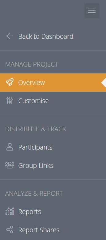
  • Mission Control is now “Manage Project”.
  • Satellites have been renamed “Group Links” under Track and Distribute. A Group Link allows multiple surveys to be completed from the one link. When an individual starts a survey from a Group Link they become a Participant and are assigned a personal link. You can create as many Group Links as you need. This can be useful when viewing reports because reports can be filtered by selected Group Links.
  • Sparks have been renamed “Reports”.
  • Shares are now “Report Shares”.
  • The project Status and Progress menus have been removed and the content has been merged into the Project Overview.
  • The Report “Layout” and “Respondents” buttons have been removed and the content has been merged into Edit. This creates a single screen for analysing and customising reports.
Manage Survey Project Overview

New Customise menus for managing projects

Manage Project Menu

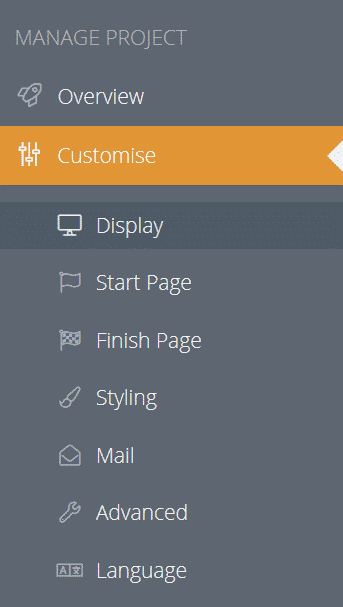
There is a dedicated new “Customise” menu when managing a Project. The customise menu has sub menus for Display, Start Page, Finish Page, Styling, Mail, Advanced and Language. Each sub menu has been redesigned and some terminology has changed to make the functionality more obvious. For example there are now a sub menus called “Start page” and “Finish page” with clear explanations on how they are used.

The changes have been implemented to make the customising options more evident and easier to understand. Instructions have been reworded and collapsed by default to save screen space.

These  customising options previously appeared in tabs under the project settings. They are no longer available in the Projects/Edit menu.

New features have been added, including an option to allow survey respondents to view their responses after they complete the survey along with more language translation packages.

A new approach for managing Tags

Survey Tags

Icons to add, delete and manage tags are now shown at the left of menus and sub menus when hovering with the mouse.

The Tags menu has been removed from the top right of the screen.

The aim of this change was to make tags more accessible, more discreet and reduce the number of visible action buttons in the main menu area.

Editing Survey Templates and content has been consolidated into a single screen

Survey Template content has been merged into Edit and the “Content” button has been removed. This simplifies the process of adding and editing survey templates.

Question Themes can now be created when adding or editing individual questions. So, there is no longer any need to leave the survey template to create a theme. Question Theme colours are now visible when survey items are collapsed. This is a visual aid to help when designing surveys and grouping questions by theme.

Survey Template

A new Project Overview simplifies the project menus and adds more features

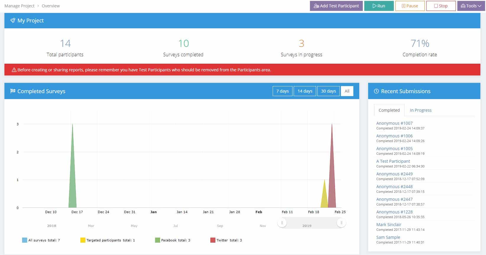
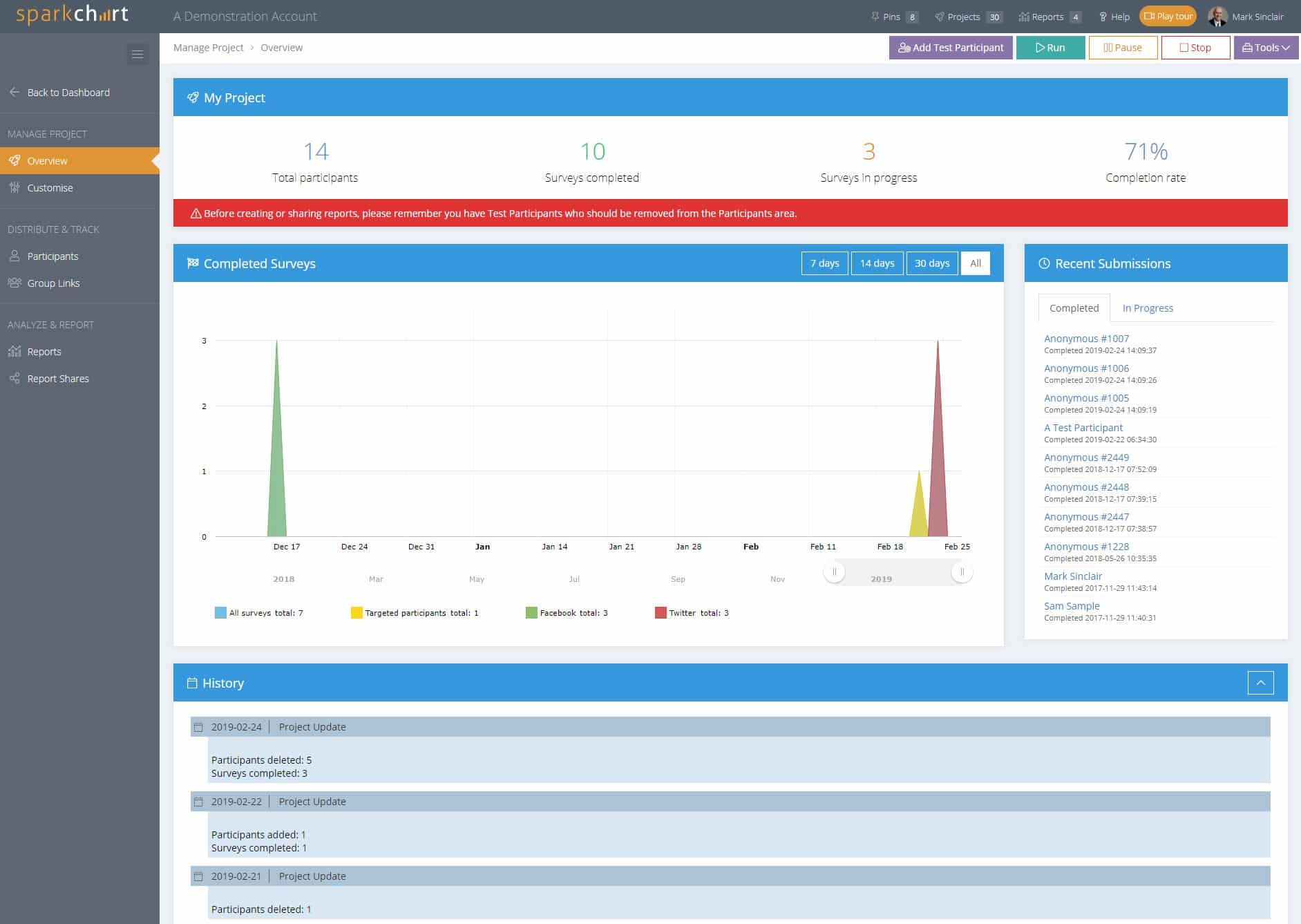
Status and Progress pages have been merged into the Project Overview

This change consolidates the project Status and Progress menus and information into one place and also makes the Project Pause and Stop functions more obvious. Our advice is to Stop projects once they are finished. The survey will no longer be available on the web and you can customise the message that is displayed if someone tries to complete the survey after it has been closed.

Quick access to the most recent individual survey responses

Project Overview now has more information, including a panel with recent survey activity listing participant names (unless anonymous), completion date and a link to view their individual responses.

Project history

The project history is shown in a timeline at the bottom of the Project Overview page.  The history is collapsed by default to reduce load times.

Manage Survey Project

New menus makes it easier to edit a Survey Template and Relaunch a Project

Survey Project Overview Tools Menu

If you need to change the survey after launching a project, the process is:

  1. Edit the survey template and then
  2. Relaunch the project

We have added a Tools menu in the Project Overview with sub menus to make this process easier.

You can also use the Pins feature to quickly move between pinned Projects and Survey Templates.

A Test Participant feature has been added to Projects

Look for the “Add Test Participant” button in the Project Overview. This feature automatically generates a test survey participant. The survey and results can then be tested and reviewed.  Add as many test participants as you wish.

When test participants have been added, a red warning message appears in the Project Overview.

Test Survey Participant

Test Participants will appear in blue at the top of the Participants Menu.

Test Survey Participant

Reports interface has been merged into a single screen with additional filtering options, sorting features & more

In addition to the terminology change, a significant number of new features have been added to the reporting.

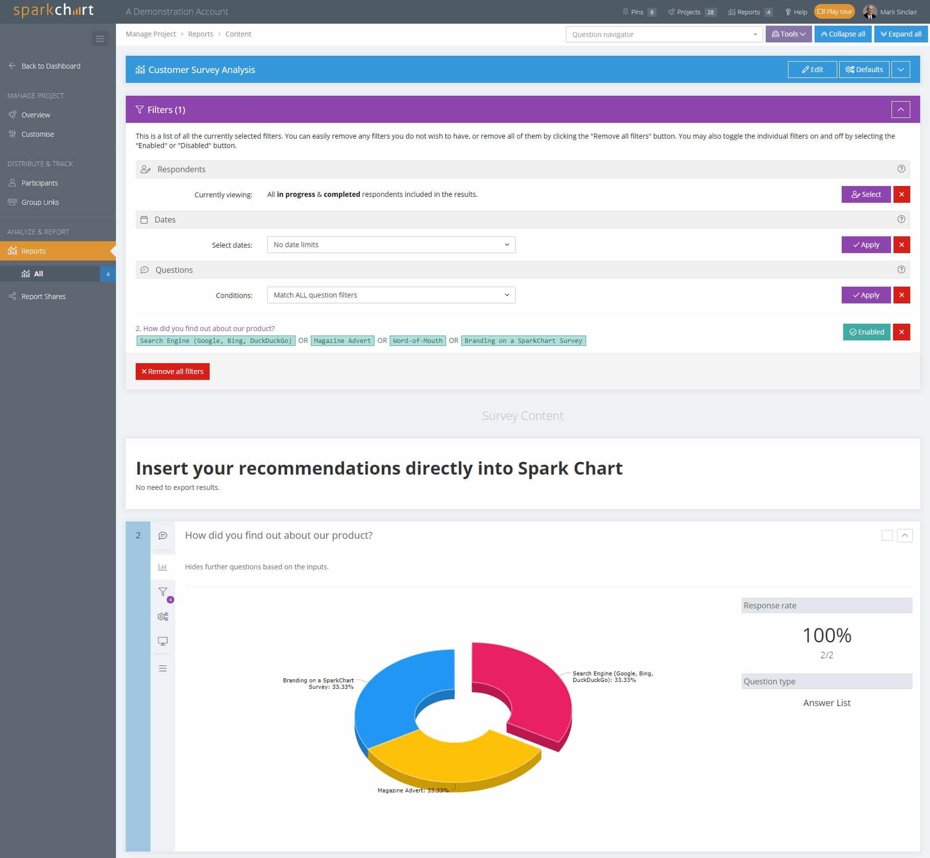
  • The report Edit, Layout, and Respondents functionality has been merged into Edit. The Respondents button and Layout button have been removed. This now creates a single screen for analysing results, filtering responses and customising reports.
  • The design of the Filters form has changed.
  • Filtering by date ranges has been added.
  • The Respondents filtering has been merged into the Filters. A message confirms if filtering by selected individuals or groups has been applied.
  • Various presentation enhancements have been made when individual questions have been filtered by selected responses.
  • Individual additional comments now show the date they were added.
  • Questions can be re-ordered using drag and drop in a report. When the report is shared, questions will apear in the re-ordered state.
  • A “Select” switch has been added to each question in a report.
  • Defaults can now be applied to selected questions (e.g. hide selected questions, apply a specific graph type, hide additional comments) as well as all questions.
Survey Report Example

Enhanced Rich Text editing options added to Mail Templates

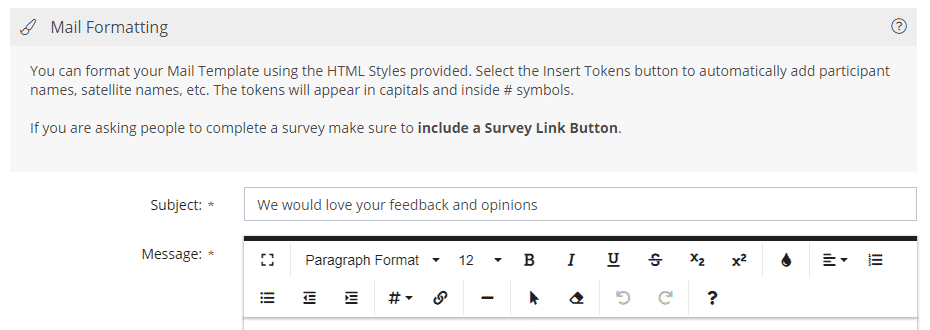
Comprehensive rich text formatting has been available in survey templates and reports for some time. Additional rich text functionality has now been added to Mail Templates and to emailing survey participants.

Survey Mail Template Rich Text

Allow survey respondents to view their responses after submitting

Users now have an option to allow survey respondents to view their recorded responses when they have completed the survey. This is controlled from the Project Customise/Display menu.

Our Zapier Integration is now public with templates

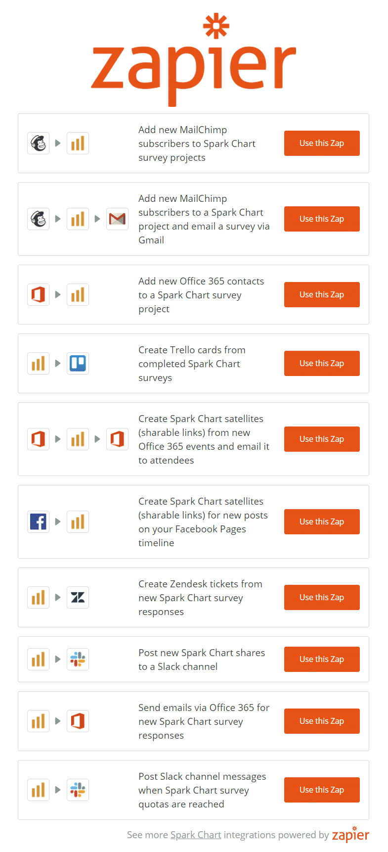
Our Zapier integration is now Public and we have created a range of templates available in your Spark Chart account Settings and also at https://zapier.com/apps/sparkchart/integrations. The Spark Chart filtering options in the Zapier integration have also been expanded to allow more fine grained actions. The Zapier integration and the templates can be accessed from the Personal Profile/Settings/Integrations menu.

Zapier Survey Integrations

And more …

There are more features in this release that you will discover along the way.